Article: The Philosophy of Black: Vanta’s Depth & Contrast
The Philosophy of Black: Vanta’s Depth & Contrast
Black isn’t just a color—it’s a statement. It’s the space between the lines, the weight of a mark, the depth that defines a form. When I created Vanta, I wanted the brand to carry that same intensity. The name itself is pulled from Vantablack, the darkest black ever engineered—a material so light-absorbing it erases dimension, making objects seem almost unreal.

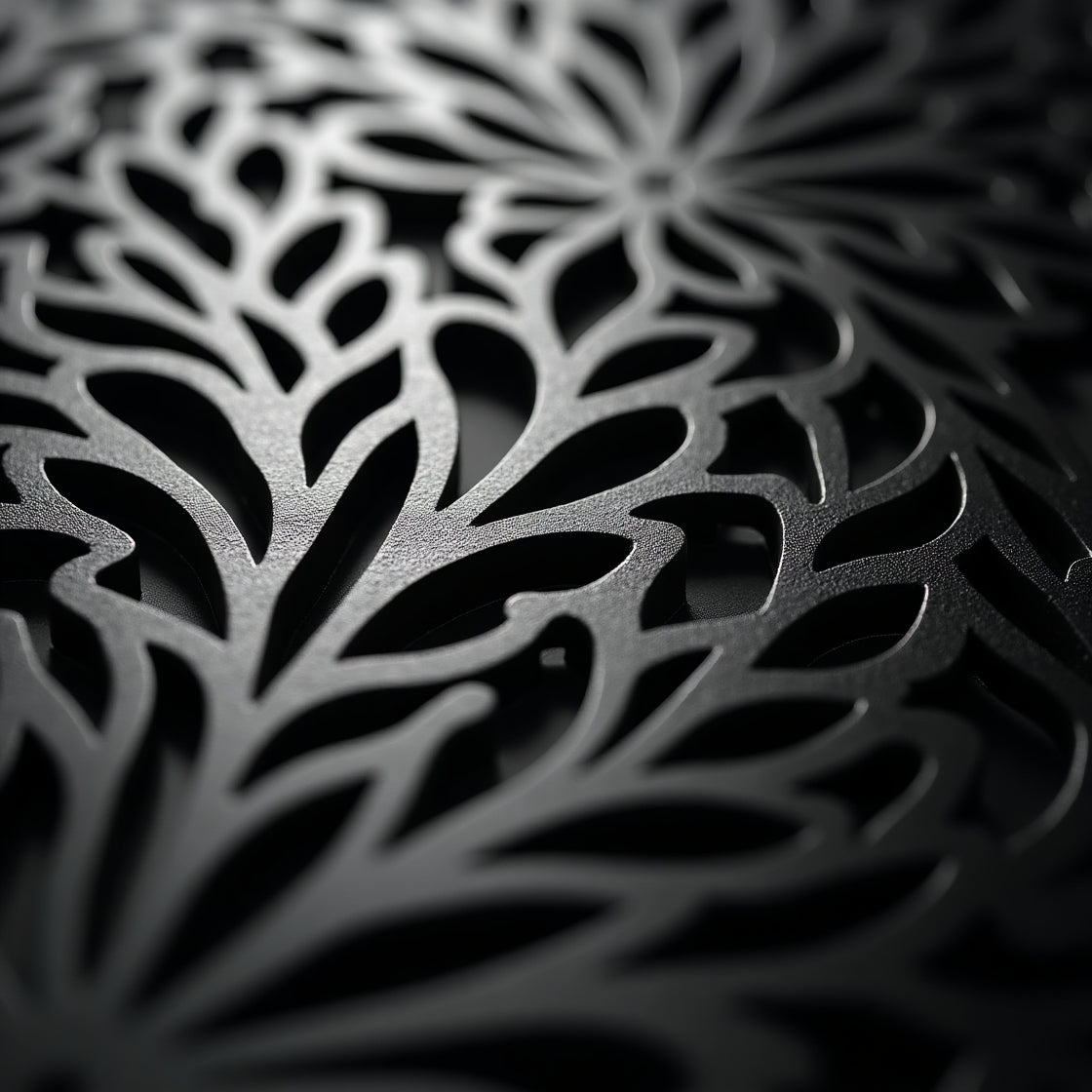
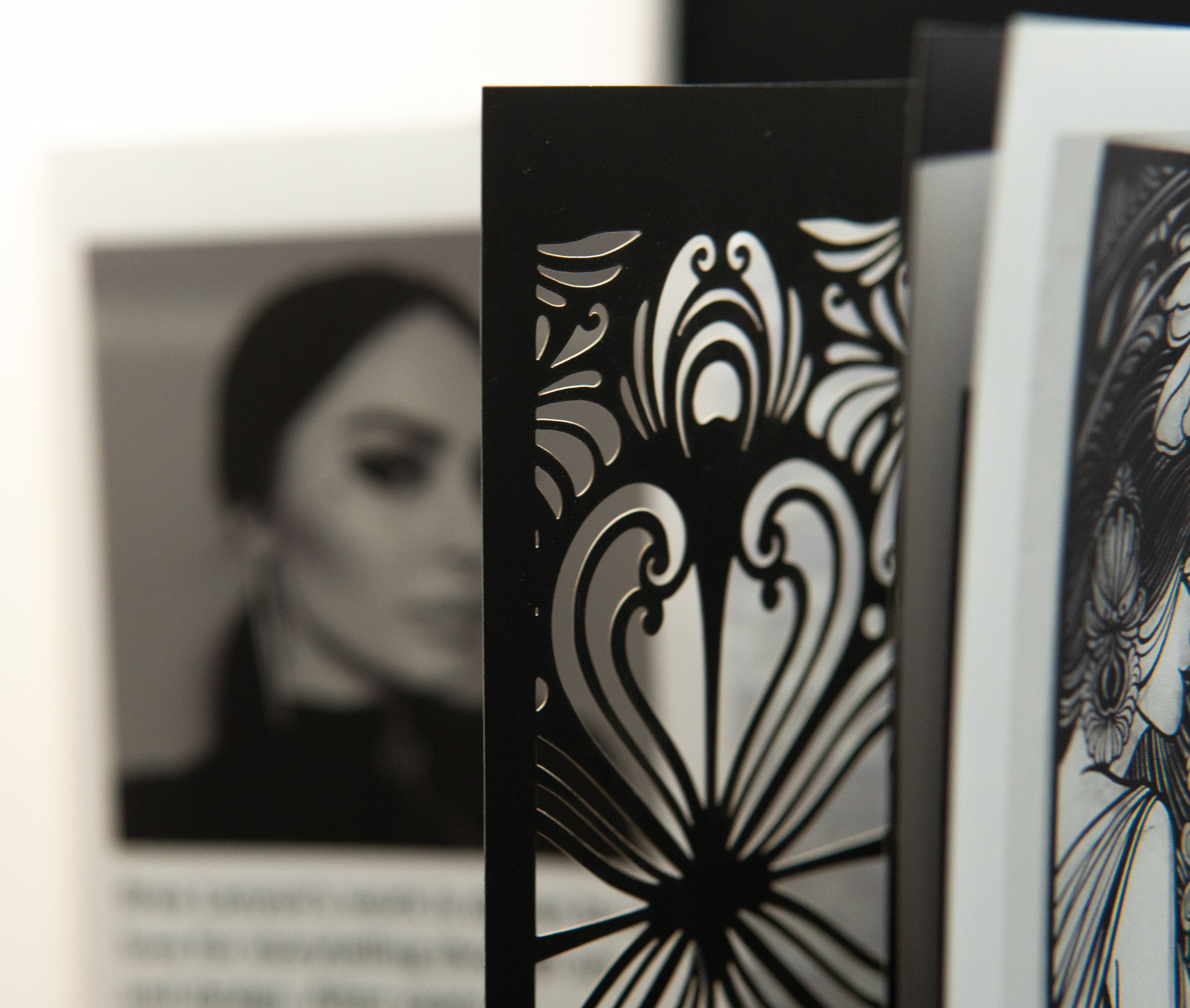
That idea resonated with me. My background is in tattooing, where black ink is everything. Bold black lines are the foundation of a tattoo’s structure—shaping the design, making it readable from across the room, holding the entire composition together. They create contrast, defining what’s there by carving out what isn’t. Black is clarity. Black is mystery. It’s the framework and the void at the same time.

Vanta works the same way. Every panel, every cutlery set, every steel design is built on the tension between light and shadow, negative space and precision. We use matte black powder coating for panels, brushed black PVD for diningware, and laser-cut detailing that plays with depth and contrast. The goal isn’t just to make something visually striking—it’s to create something that feels elemental, something that carries weight.

Black is the absence of noise. It doesn’t beg for attention; it commands it. That’s the philosophy behind Vanta. No unnecessary ornamentation. No filler. Just bold, refined, and deliberate design.